The Role of Color Psychology in Creating Calming, Streamlined Environments
Understanding the Impact of Color on Perception
Color is more than a visual experience; it profoundly influences our emotions and behaviors. In various environments, the role of color psychology becomes crucial to creating spaces that promote tranquility and focus. By strategically incorporating different shades and hues, designers can mold environments that resonate positively with the people who inhabit them.
The Power of Colors
Different colors invoke distinct responses in the human mind, making their application significant across various settings. Here are a few examples of how color influences our emotions:
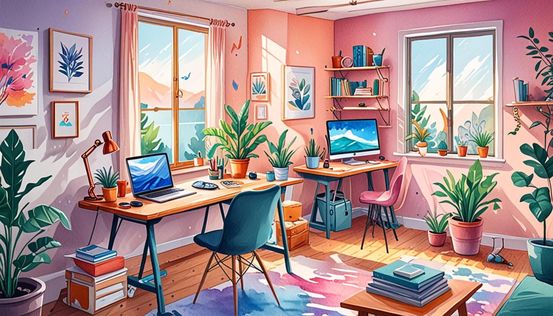
- Blue: This color is often associated with calmness and serenity. It frequently appears in bedrooms, as it helps create a restful atmosphere conducive to sleep. Additionally, blue is a popular choice in offices since it can enhance concentration and productivity. A study from the University of British Columbia noted that individuals working in blue environments completed tasks more efficiently than those in red or white spaces.
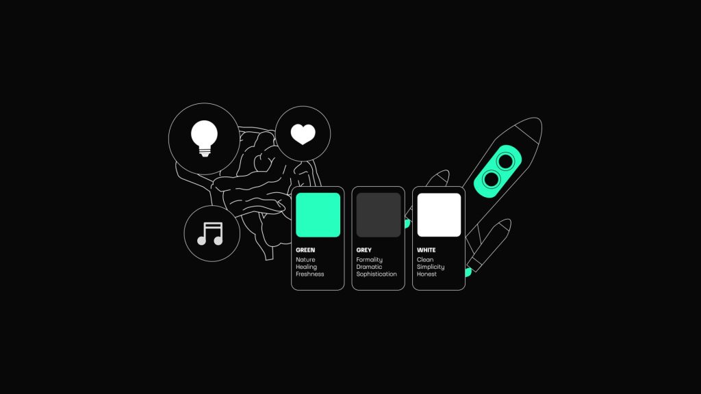
- Green: Symbolizing nature and rejuvenation, green is particularly popular in spaces designed for relaxation, such as healthcare facilities and homes. Its soothing properties have been linked to decreased stress levels and improved mood, making it an ideal choice for settings where comfort is a priority. Some workplaces incorporate potted plants as a way to introduce green elements, further enhancing employee well-being and creativity.
- Neutral tones: Shades such as beige and grey create a streamlined look that enhances organization. These colors are often used in minimalist designs, promoting a sense of calm and reducing visual clutter. A neutral palette can serve as an excellent backdrop, allowing individuals to focus without distraction.
By understanding how colors affect our mood and productivity, designers can tailor environments to foster a sense of peace and clarity. A space imbued with the right colors not only enhances well-being but also boosts efficiency, particularly in places like workspaces and homes. Research has shown that well-thought-out color schemes can increase productivity by as much as 20% in workplaces, highlighting their relevance in modern design.
Delving Deeper into Color Choices
This article explores the mechanics behind color psychology and how to effectively implement it in various settings. For instance, incorporating shades of yellow can inspire creativity and enthusiasm, making it a great choice for brainstorming rooms. Alternatively, muted tones in a conference room can lend an air of professionalism and seriousness, promoting focused discussions.
Discover how thoughtful color selections can transform any area into a calm oasis or a streamlined hub of activity. Understanding these dynamics opens up possibilities for enhancing community spaces, retail environments, and even personal sanctuaries. By applying the principles of color psychology, we can create not just aesthetically pleasing spaces, but also environments that nurture and inspire us.
DISCOVER MORE: Click here to learn about the latest in minimalist design
Color Choices for Specific Environments
As we delve deeper into the application of color psychology, it’s essential to recognize that the setting plays a pivotal role in how colors are perceived and their effects on the environment. Different environments serve varied purposes and evoke distinct emotional responses. By understanding the nuances of color selection, we can enhance the function and ambiance of any space.
Color Selections in Healthcare Settings
In healthcare environments, color choices can significantly influence patient experience and recovery outcomes. Soft blues and greens are often favored for patient rooms and waiting areas, as they create a calming atmosphere that can reduce anxiety. Research from the Harvard T.H. Chan School of Public Health indicates that colors like blue can lower heart rates and promote a sense of tranquility. These soothing colors are complemented by natural light and well-placed greenery, forming a holistic environment that facilitates healing.
Enhancing Workspaces with Color
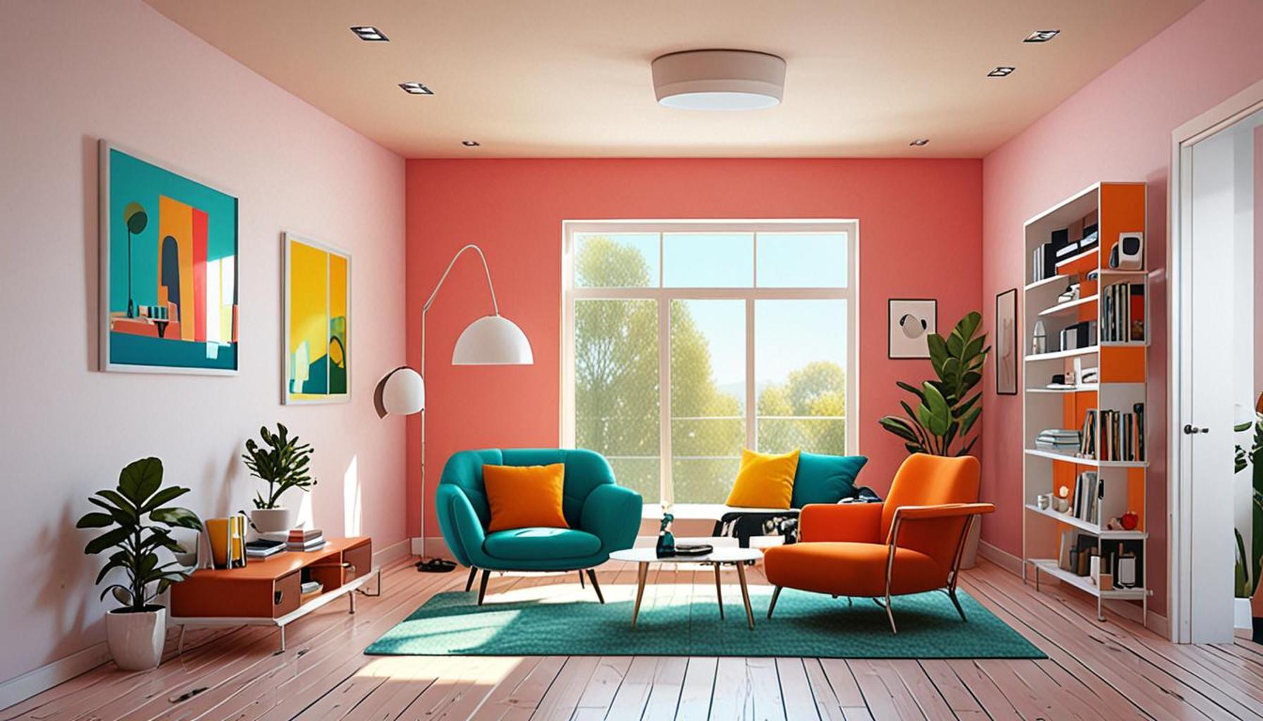
In the workplace, the color scheme is not only a matter of aesthetics but also a strategic decision that can impact employee performance. Consider how vibrant colors like yellow can stimulate creativity in collaborative spaces, while cooler shades like grey can instill a professional tone in boardrooms. A 2018 survey by the American Society of Interior Designers found that offices decorated with lively colors boost employee satisfaction and improve morale. Here are some color options to consider for various workplace settings:
- Red: Energizing and attention-grabbing, often used in high-energy environments like sales offices.
- Orange: Cheerful and friendly, suitable for collaboration areas that encourage teamwork.
- Purple: Associated with creativity and luxury, ideal for spaces aimed at innovation and brainstorming.
- White: Clean and minimalist, widely adopted in modern office designs to cultivate both focus and clarity.
By intentionally incorporating these colors, workspace designers can cater to the psychological needs of employees, promoting productivity and a positive work culture.
The Role of Color in Environmental Design
Beyond healthcare and workspaces, color psychology extends into retail and public spaces, affecting consumer behavior and satisfaction. Warm tones like red and orange can evoke a sense of urgency, prompting quicker purchasing decisions in retail settings. In contrast, blues and greens create a relaxing atmosphere in dining environments, allowing patrons to linger longer and enjoy their experience.
Understanding how color impacts perception and behavior not only helps in creating aesthetically pleasing environments but also fosters a deeper connection between users and their surroundings. As we continue to explore the dynamics of color psychology, we unveil the potential of color choices to not just design spaces but to engineer experiences that resonate with individuals on a personal level.
The Impact of Color on Emotional Well-Being
Color plays a pivotal role in influencing our emotions and perceptions, shaping the environments where we live, work, and thrive. Specifically, certain hues can evoke feelings of peace, tranquility, and clarity. For instance, soft blues are often associated with serenity, reducing stress and promoting focus. This psychological effect can be particularly beneficial in settings designed for relaxation, such as homes and wellness centers.In corporate environments, colors such as greens may enhance productivity and creativity while providing a sense of balance and calm. These colors can help employees feel at ease, resulting in a more harmonious workplace. Moreover, utilizing neutral shades in conjunction with vibrant accents fosters a streamlined aesthetic that can enhance both visual appeal and emotional comfort.By being mindful of color choices, designers can create spaces that not only look aesthetically pleasing but also promote mental well-being. Every choice, from wall paint to decor items, can contribute to a holistic environment that nurtures calmness and efficiency. This deliberate approach underscores the importance of integrating color psychology into interior design, ensuring spaces are not only functional but also enriching to the users’ experience.
| Category | Benefits |
|---|---|
| Color Selection | Enhances mood and emotional stability. |
| Environmental Design | Encourages focus and reduces distractions. |
Understanding the implications of color psychology directly influences how environments are structured. Whether for a public space, a private retreat, or a corporate office, the thoughtful integration of color can lead to spaces that not only look beautiful but also elevate emotional health and well-being.
DIVE DEEPER: Click here to learn about smart home solutions
Color Applications in Homes and Recreational Spaces
As attention to mental well-being and stress reduction increases, homeowners are becoming more intentional in their color choices to create spaces that provide both comfort and calm. Color psychology plays a significant role in home design, where hues can transform living areas into personalized sanctuaries.
Crafting Peaceful Living Spaces
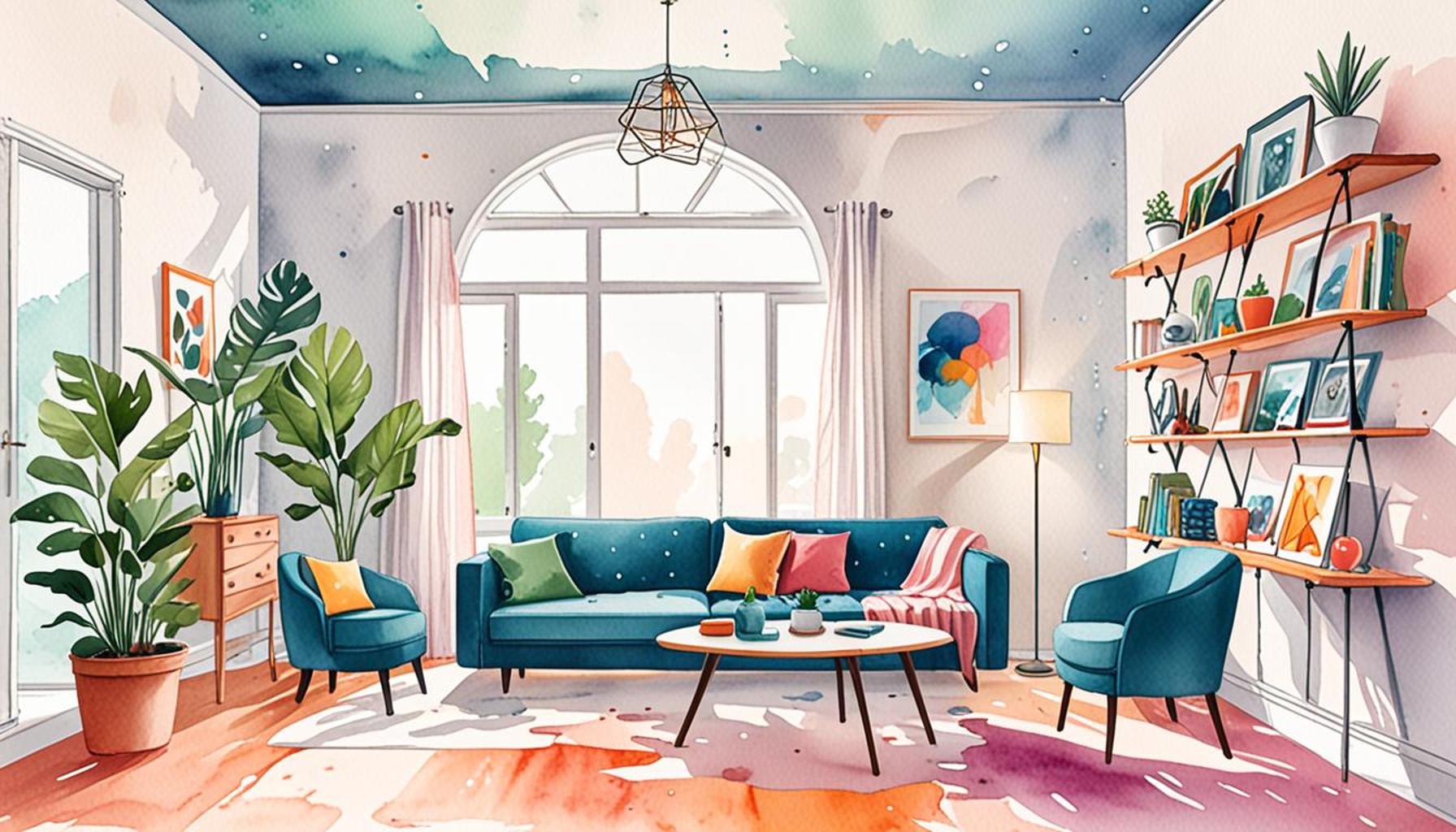
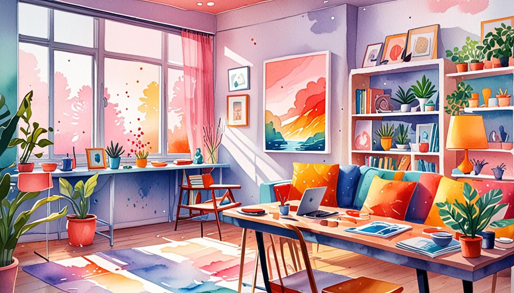
In bedrooms and relaxation areas, colors that promote sleep and tranquility are essential. Soft lavender and pale pinks are often chosen for their soothing qualities, while muted earth tones like taupe and beige can create a grounded atmosphere. According to a study by Houzz, homeowners who opted for softer hues in their bedrooms reported improved sleep quality and lower stress levels. This aligns with the notion that neutral colors aid in decluttering the mind, paving the way for a peaceful night’s rest.
Beyond aesthetics, incorporating mindfulness practices in home design can further enhance the effects of color. For instance, using a combination of light greens and soft yellows in a meditation nook can foster serenity and encourage mental clarity. Moreover, integrating natural elements such as plants can synergize with these colors, creating a holistic approach to well-being at home.
The Influence of Color in Recreational Environments
Public and recreational spaces also benefit from thoughtful color selections. In parks, trails, and leisure centers, vibrant yet calming colors can enhance the experience of visitors. Shades of teal and turquoise are particularly effective in promoting relaxation along coastal environments, evoking images of serene waters. A report by the American Psychological Association highlights that outdoor environments adorned with soothing colors significantly reduce feelings of stress and freshen the mind, making them ideal for relaxation and recreational activities.
Furthermore, the design of wellness centers and fitness studios has adopted color strategies to motivate and engage participants. Bright colors like lime green and sunny yellow are often used in yoga studios to energize the atmosphere while maintaining a calm ambiance. Research indicates that participants in brightly colored yet calming environments tend to experience greater satisfaction and motivation during workouts.
Color Psychology in Educational Environments
In educational environments, color psychology can greatly influence learning and behavior. Soft, muted tones in classrooms encourage focus and calmness, while brighter accents can promote creativity and engagement. A study published in the Journal of Environmental Psychology found that classrooms decorated with cooler colors led to increased attention spans among students, while warmer, more stimulating colors boosted overall participation during collaborative projects.
In summary, utilizing color psychology across diverse environments not only enhances the visual appeal of spaces but also supports mental well-being, productivity, and relaxation. The strategic use of color fosters a deep connection between individuals and their environments, creating a tapestry of experiences that resonate on both emotional and psychological levels. As our understanding of color psychology expands, the future of design will likely see an even greater emphasis on creating environments that nurture and inspire through the principles of color.
DISCOVER MORE: Click here to find out how technology enhances minimalist living
Conclusion: The Transformative Power of Color Psychology
In conclusion, color psychology serves as a vital tool in shaping environments that prioritize mental wellness and serenity. As we delve deeper into the effects of color on our emotions and behaviors, we uncover its profound ability to influence our daily experiences across various settings—from homes to recreational areas and educational institutions. The evidence supporting the calming effects of soft hues in bedrooms and the invigorating nature of vibrant colors in fitness studios not only reveals the psychological implications of our color choices but also invites us to consider how we can harness this knowledge for better living.
As individuals seek to create spaces that reflect personal values of tranquility and mindfulness, understanding the significance of color becomes increasingly important. Communities, too, benefit from recreational spaces designed with soothing colors that evoke peace and positivity. Furthermore, in educational settings, the right color palettes can stimulate focus and creativity, enhancing the learning process for students of all ages.
Ultimately, this exploration into the role of color psychology encourages us to be more intentional with our surroundings. As designers, homeowners, and educators, we hold the capability to transform experiences through thoughtful color application. Looking ahead, the integration of color psychology into the consciousness of design and functionality will likely continue to evolve, shaping our environments into intuitive, calming spaces that contribute to overall well-being. With this knowledge, anyone can embark on a journey to curate a more harmonious environment, one color at a time.